Friday, April 24, 2009

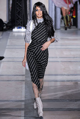
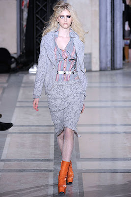
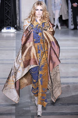
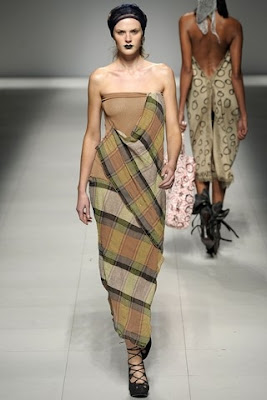
Final post - color forcasting of Fall Winter 2010

In these 2 or 3 years, I believe that Vivienne Westwood will set the theme of the collection first and then set the color scheme. If not, the use of color will not be so close to the theme .

According to my research, these few years Vivienne Westwood's theme inspired by its country's politic and social event very much. Also, she concerns the global issues very much.The use of color in her collections can reflect her opinion on these events.

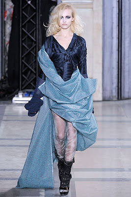
Recent years, she concerns the global environment very much. You can see that she puts this idea on her fall winter 2009 collection, S/S 2009 and A/W 2008. She uses mostly diffreent value and intensity of bluse and green to reflect the natural environment she wants.(i.e. Blue sky, fresh and cool, and also rainforest)

If there is no great issue in its own country, she will still concern the environment issue and the use of color will reflect on that.

According to my observation, Vivienne Westwood uses one or two colors as key colors, no matter there is change of value and intensity. However, when there is 80% using the key color there is10% using the contrasting color, which is the complementary or triad colour of the key colour.

However, even there are keys colors, Westwood can create design by using different color scheme. In these years, she uses more 2 color schemes in one collection.

Also, there is differernce between Spring/Summer collection and Fall Winter collection. In S/S collection, the use of color are in high value and high chroma, and the use of white colour will be much more. On the other hand, the use of color in Fall Winter collection will be in lower value and lower chroma and the use of black will be more than white.

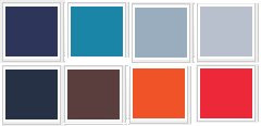
And I found that Vivienne like to use brown and red (07-08A/W,06-07A/W, 05A/W, 01A/W and even in 1990s) and blue(2009 fall winter, 06-07A/W, 01A/W ) as key colours. Therefore, I think in 2010 Fall winter would use brown and red as key colors because Vivienne Westwood use it for many years in fall winter collections.

From the past collections, Vivienne Westwood like to use achromatic scheme in her collections. Therefore, I believe she would use achromatic scheme in Fall Winter 2010 collection. But the portion will be very small, up to 5%. Also, black, grey, white may be appear , but one color in one design clothing, which means all black, all white and all grey, this has happened for many years like Fall Winter 2009, A/W08-09, S/S2008, etc...It may appear again

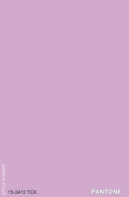
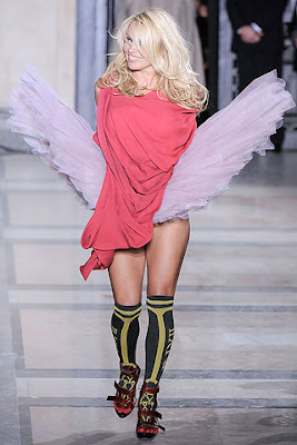
Also, I believe Westwood will use Mono chromatic scheme and analogus scheme as these schemes appears many times. So I believe bright yellow and pink and bright purple will be used in Fall 2010

I don't think Triad will exist in one design in the collection, but I think there would be at least one design that is all blue in a collection. then, it creates triad scheme in the overall collection. Then it is the triad of the key color - red.

Also, I think green will appear as a contrasting color of red. And green can represent the theme of protecting the natural environment.

Actually, when the key color used is in low value, the other color will be in high value. You can see in 2009 Fall Winter and 2008-2009A/W Collections
Thursday, April 23, 2009

Project information of my groupmates

http://08326515d.blogspot.com/
http://itc-08356651d.blogspot.com/
http://08219542d.blogspot.com/
The above blogs shows that Vivienne Westwood's collection from 80s to 2000s.

http://08054693d.blogspot.com/
http://08150124d.blogspot.com/
http://08098156d.blogspot.com/

The above blogs shows the history background, social situation, political climate and culture faced by Vivienne Westwood.

http://08156788d.blogspot.com/
Advertisement related to Vivienne Westwood

Friday, April 17, 2009

snapshot - best 20

Men


Girl


Shoes and Accessories


T-shirt


Denim

Monday, April 13, 2009

Orb

According to the history of UK, every queen or king will have an orb when they have crowning. All the orbs has a crucifix(cross), representing royal authority and justice.


Another UK brand, Harris Tweed also has it logo similar to the royal .

How about Vivienne Westwood?


It also follows the Royalty, and then she adds on another circle. That's her philosophy - everyone cannot abandon history. However, she had never turned her back on tradition; instead, she had always used tradition to further her own ends.


Friday, April 10, 2009

Lines of collection

The least formal of the Westwood labels, Anglomania, was launched in 1997. It targets younger buyers, and seldom shown on the catwalks. The items emphasis mix and match

The ready-to-wear Red Label Collection is usually shown in London, which is a diffusion line under Gold Label. Its target customer is office lady. The clothing is much easier for people to carry than Gold Label.

The ‘top of the line’ Gold Label collection is produced in the UK, with fashion shows in Paris. It uses British fashion traditional materials while producing an effect that is sexy and elegant. Also, it reflect the original idea and style of the designer

The Westwood menswear label, MAN is largely influenced by his husband Andreas, MAN gives traditional British tailoring a new twist.


Since the Gold Label can mostly reflect Vivienne Westwood idea, so I just use its Gold Label collection to do the analysis

Monday, March 30, 2009

Vivienne Westwood Fall 2009 Ready to wear


Vivienne Westwood want to arouse our awareness about the envrionment issue in her collection "+5°," the meaning of "+5°" is that 5 degrees are counted to rise as CO2 levels skyrocket. She spread the message onto the T-shirt

I think that Vivienne want to shows that we should do something to cool down the earth temperature. Therefore, she use mostly blue - cool color as a key colour to represent the message.


I think it is hard to analaysis her color scheme by whole collection. So, I just take a few for an example.


Vivienne Westwood use mono-chromatic scheme. You can see that 1st picture, even the material and the hue is the same, but the tint and tone of colour are different, so it creates a harmonious effect. 2nd picture is also use different tint and tone and even different material, and it match with the colour of the shoes, which has a little bit red.


Also, she uses achromatic scheme. The proportion of this scheme is quite small in the collection.


And finally, she use complementary color scheme. This scheme is not easy to observe because Vivienne use contrasting color with differnt value.

Friday, March 27, 2009

Vivienne Westwood S/S 2009 Ready to Wear


The theme is 'Do it yourself'

Vivienne do this show because she was inspired by the rainforest. she want to save the rainforest and encourage us not to consume, that is "less consume, but do it yourself".

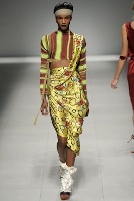
I believe that Vivienne want to show the color of the rainforest, therefore she use yellow and brown( lower value of orange) as a key color. As you can see Vivienne Westwood use more models with darker color skin.


Vivienne Westwood use analgous scheme. First one combine with brown, yellow and yellow green, which is adjacent colors.


Then she uses mono chromatic scheme. you see, there is same hue but different shade and tint.


Vivienne Westwood also use Triad, you can see there are red, blue and yellow.


And lastly, she use achromatic scheme