Monday, March 30, 2009

Vivienne Westwood Fall 2009 Ready to wear


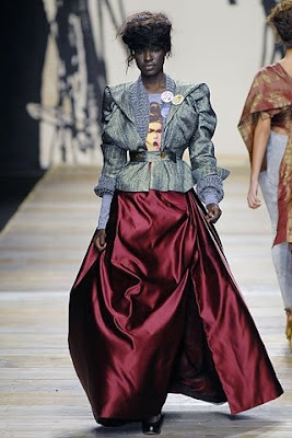
Vivienne Westwood want to arouse our awareness about the envrionment issue in her collection "+5°," the meaning of "+5°" is that 5 degrees are counted to rise as CO2 levels skyrocket. She spread the message onto the T-shirt

I think that Vivienne want to shows that we should do something to cool down the earth temperature. Therefore, she use mostly blue - cool color as a key colour to represent the message.


I think it is hard to analaysis her color scheme by whole collection. So, I just take a few for an example.


Vivienne Westwood use mono-chromatic scheme. You can see that 1st picture, even the material and the hue is the same, but the tint and tone of colour are different, so it creates a harmonious effect. 2nd picture is also use different tint and tone and even different material, and it match with the colour of the shoes, which has a little bit red.


Also, she uses achromatic scheme. The proportion of this scheme is quite small in the collection.


And finally, she use complementary color scheme. This scheme is not easy to observe because Vivienne use contrasting color with differnt value.

Friday, March 27, 2009

Vivienne Westwood S/S 2009 Ready to Wear


The theme is 'Do it yourself'

Vivienne do this show because she was inspired by the rainforest. she want to save the rainforest and encourage us not to consume, that is "less consume, but do it yourself".

I believe that Vivienne want to show the color of the rainforest, therefore she use yellow and brown( lower value of orange) as a key color. As you can see Vivienne Westwood use more models with darker color skin.


Vivienne Westwood use analgous scheme. First one combine with brown, yellow and yellow green, which is adjacent colors.


Then she uses mono chromatic scheme. you see, there is same hue but different shade and tint.


Vivienne Westwood also use Triad, you can see there are red, blue and yellow.


And lastly, she use achromatic scheme

Thursday, March 26, 2009

Vivienne Westwood A/W 2008-2009 Ready to Wear


As Vivienne Westwood cares about the problem of global warming, she imagine a society of jungle-dwelling eco-warriors. The clothes that resulted are the warriors' uniform.

The pattern on the clothing are some flowers, snakes and butterflies.

The low value color show the urban jungle as we lives while the hign value colors show the natural environment

Color Scheme: mono-chromatic(black, violet and red violet) and analogus (yellow, green and blue)

I think Vivienne show the actually envrionment we live, so she use matellic colour, because, she believe that that's still hope, so that she use yellow, blue and green

Sunday, March 22, 2009

Vivienne Westwood S/S 2008 Ready to Wear


color scheme: Mono-chromatic (red and pink), Analogus(yellow and green)


The theme is 「56」。Vivienne Westwood create this collection because of human right and freedom. She object the government that proposing anybody could be in jail for 56 days before going to the court. So, she use white and yellow as key colors as white represent innocence and yelloe represent hope. I believe she hope the government can stop this proposal because there may be some innocent if they are in jail.

One thing that is interest, as yellow and whote are her key colors, she suddenly use a violet as contrasting color. There is only one violet design in the collection.

She loves to do this in her collections!

Saturday, March 21, 2009

Vivienne Westwood A/W 2007-2008 Ready to Wear


The show called "Wake Up, Cave Girl" The collection is back to the human history - caveman. Therefore, you can see that the key color are red and brown and yellow. And the chroma of the collection is quite low overall. It may want to present a mysterious image of the cave age

However, as the theme of this collection is called"Wake up, Cave girl", therefore, there are a little bit use of high chroma of colors.
Apart from the key color, Westwood also use a complentary color of key colour.
for example, red is the key colour and Westwood use green as a complentary colour of it. Also, brown(lower value of orange) is another key colour, but she uses blue as its complentary colour.

And here are the color scheme she used

Triad colour scheme(blue+red, yellow +red)

Analogus Scheme: The first picture, the tartan itself already has its own colour scheme, that is orange and brown, which is already mono chromatic scheme, but adding the yellow pieces, it become analogus. The 2nd one is combined with red and violet


Vivienne Westwood also use Achromatic scheme, but there is little proportion of the whole collection

Mono chromatic scheme: As I said before on the 3rd picture, tartan itself is already is mono-chromatic scheme. Also, these two also use mono chromatic scheme


Vivienne Westwood also uses complematnary colour

Sunday, March 15, 2009

Vivienne Westwood S/S 2007 Ready to Wear


In this collection, you see that Westwood mostly use all white, all black, high value of violet and yellow. High value of colour make people think like'It's time to for spring', giving a new and fresh image. However, when you look at the detail of each picture, you will find that she use a few of color scheme.

Complementary color scheme. The first picture, the woman has a pink hair contrasting the green. The second one, the woman holding flowers with many green parts, contrasting the red clothing. The third one is yellow contrasting the violet


It is analogus scheme


This is triad color scheme. The first one using all high chroma of red, blue and yellow, that becomes pink, light blue and sharp yellow. The 2nd one also use triad which is green and violet


Westwood also use achromatic scheme. However, there is a small proportion.

Tuesday, March 10, 2009

Vivienne Westwood A/W 2006-2007 Ready to Wear


The key color this time is blue, you can see that there are about 80% of collection containging blue color. Also, another 20% are other color such as red. She loves to use another triad color or complementary color of the key color in her colections


color scheme

mono-chromatic: different values of blue

this is red , a triad color of blue.

Sunday, March 8, 2009

Vivienne Westwood S/S 2006 Ready to Wear


achromatic scheme : last row 2nd picture, black dress and white shoes

mono-chromatic: blue+ light green blue, brown= beige

analogus: pink and beige

In this collection, you mostly see that she use blue as key color. And overall, the chroma of the collection is quite high. Only black is not high value.

Overall, you can see that it is quite hamonious. However, when you look at the 2nd row 1st picture, you see?? Red+blue+yellow, a triad color scheme is used! That's what Vivienne like to play with the color.

Although you see that there are some design combine with blue and black. The low value black make comtrast with the high value of blue, which is emphasising the blue.